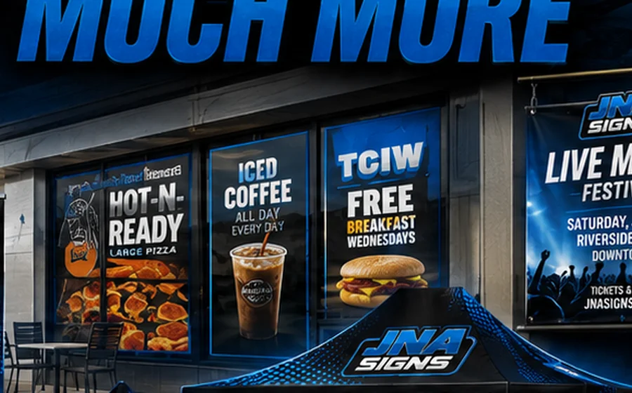
Design for where the sign will be seen.
Before choosing a sign size, consider how far away the viewer will be, whether the viewer is walking or driving, the angle of approach, lighting conditions and how much time they will have to read the message.
A sign only works if people can see, read and understand it in the time they actually have. Viewing distance, movement, contrast and message length all matter.

Before choosing a sign size, consider how far away the viewer will be, whether the viewer is walking or driving, the angle of approach, lighting conditions and how much time they will have to read the message.
Decorative or unusually narrow typefaces can become difficult to read when viewed from far away. Use strong letterforms, adequate spacing and clear hierarchy. If a sign needs several lines, make the most important message visually dominant.
Busy backgrounds, too many colors and competing design elements can reduce visibility. Color combinations with strong light/dark separation usually read more clearly. The goal is not simply to fill the available space—it is to make the message understandable.
Share a photo of the location, the approximate viewing distance and the intended sign size. JNA can help evaluate the design and recommend a clearer approach before production.
Request a Sign ConsultationTell JNA what you need and we’ll help match the product, material and production approach to the job.